Excel Pivot Tables: Tips for Finance Professionals
Though many finance professionals are somewhat familiar with PivotTables, many powerful functionalities are missed as they are buried under numerous not-so-useful options and functions. This comprehensive guide provides the essential techniques you need in order to excel at PivotTables for financial reporting and analysis.
All the essential tips are collected here for quick reference. Bookmark this page for future use.
Table of Contents
- Finance-Specific Examples
- Why Use PivotTables in Excel?
- How to Create a PivotTable?
-
Best Practices and Helpful Tips & Tricks
- Use Meaningful Field Names and Built-in Number Formatting
- Expand/Collapse Multiple Hierarchies at Once
- Nested Sorts for Financial Statement Order
- PivotTable Data Sources
- Choose the Right Layout: Compact vs Tabular
- Enable Repeat Item Labels for Data Export
- Configure Subtotal Display
- Show Missing Values as Zero
- Preserve Custom Formatting Through Refreshes
- Customize PivotTable Styles
- Copying a Custom PivotTable Style to Another Workbook
- Use Slicers for Client-Friendly Filtering
- Format Slicers
- Insert Timeline for Period Analysis
- Link Slicers Across Multiple PivotTables
- Customize the Pivot Table’s Value Field Measure
- Calculated Fields and Items
- Grouping Dates and Numbers
- Clone PivotTable for Multiple Entity Reports
- Data Model Integration
- Accelerate Excel & PivotTables
- Next Steps
- FAQ
Finance-Specific Examples
While most PivotTables are used for simple summaries with one row and one column field, they truly shine in complex financial scenarios with multiple data layers. The best examples are financial reports like Profit and Loss statements and Balance Sheets, where PivotTables can organize and summarize granular financial data efficiently using account hierarchy mappings.
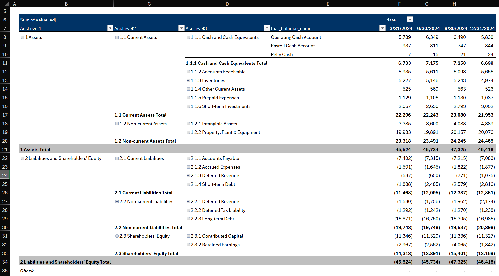
Example 1: Balance Sheet Pivot Table
Below is a balance sheet created using an Excel PivotTable. The compact layout keeps the report clean and organized, while still allowing you to drill down into detailed account information as needed:
Expand or collapse account categories with a single click
View detailed breakdowns behind each total
Use slicers to quickly filter by Entity, Date, or Department
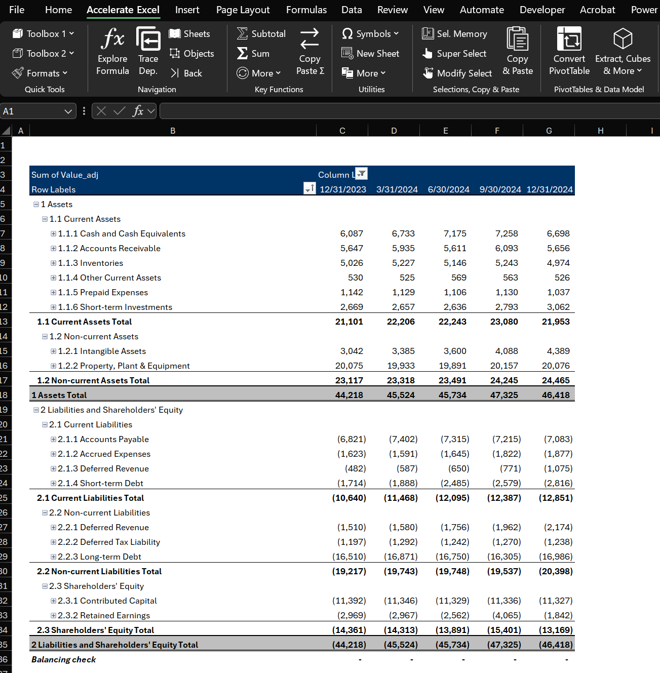
Balance Sheet created using PivotTable with account hierarchy mapping, showing Assets, Liabilities, and Equity sections with proper subtotals
The key advantage here is to use an account hierarchy mapping (based on your chart of accounts). This allows the PivotTable to automatically create proper subtotals for each section (Current Assets, Non-Current Assets, etc.) without manual calculations.
Interested in how that PivotTable was built? Read this Excel tutorial: Create a Balance Sheet PivotTable in Excel .
Example 2: P&L / Income Statement Pivot Table
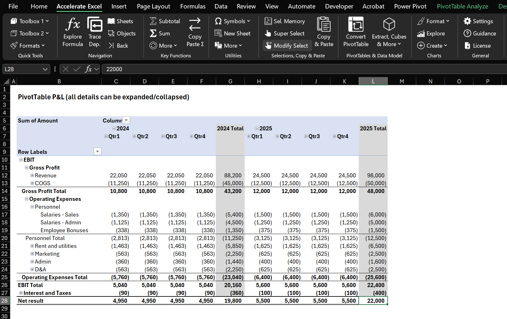
Comprehensive P&L statement created with PivotTable showing Revenue, Cost of Sales, Operating Expenses, and Net Income with automatic subtotals
Both examples leverage account hierarchy mapping where each account in your chart of accounts has a hierarchy level (e.g., Account → Sub-category → Category → Financial Statement Section → Account Name). This approach eliminates the need for complex calculated fields for basic financial statements.
Are you a beginner with PivotTables? Check out our step-by-step tutorial explaining how to create a P&L pivot step-by-step.
Why Use PivotTables in Excel?
PivotTables create summaries and reports much faster than manual worksheet functions. They're incredibly flexible—you can group, filter, and rotate data to view it from different angles, making it easier to draw meaningful conclusions or brainstorm future reports.
Key Benefits for Finance Teams
Speed and Efficiency: PivotTables excel at analyzing large amounts of data, revealing patterns and insights that might be hidden in raw data. They're also perfect for prototyping reports and analysis before building more complex spreadsheet solutions.
Essential for Excel Data Analysis: Whether you're working with sales figures, financial data, or any large dataset, PivotTables in Microsoft Excel transform complex information into clear, actionable visualizations. They're a must-know tool for effective data analysis and reporting in Excel.
Hierarchy Integration: PivotTables automatically generate proper financial statement structures with subtotals, eliminating manual formula work.
How to Create a PivotTable?
Step 1: Data Preparation - Well-Structured Data
Ensure your source data is in a tabular format (rows and columns) with a single header row. No blank rows or columns should be inside the data range. Converting your raw data into an official Excel Table (via Insert > Table) is recommended; this way, your PivotTable source can expand automatically as new data is added.
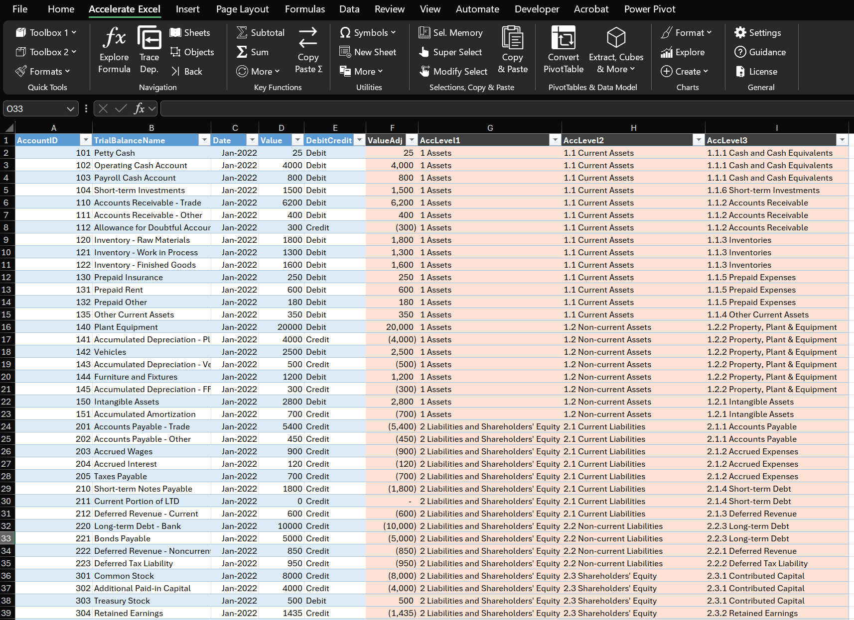
Well-structured financial data table ready for PivotTable creation, showing proper column headers and clean data format
Step 2: Create PivotTable
Select any cell in your data range (or the entire range) and go to Insert > PivotTable. Choose to place the PivotTable on a new worksheet (for a fresh space to work) or on an existing worksheet at a specific location.
Step 3: Setup the PivotTable View
Once created, you will see a PivotTable placeholder and a PivotTable Field List panel. Drag fields into the Rows area for categories (e.g., Account Hierarchy, Account Name), into Columns area for series or comparison categories (e.g., Month, Year), and into Values area for the numbers you want to aggregate (e.g., Amount). If you have any fields for filtering (like Date Range or Department), you can drop them in the Filters area for top-level filtering.
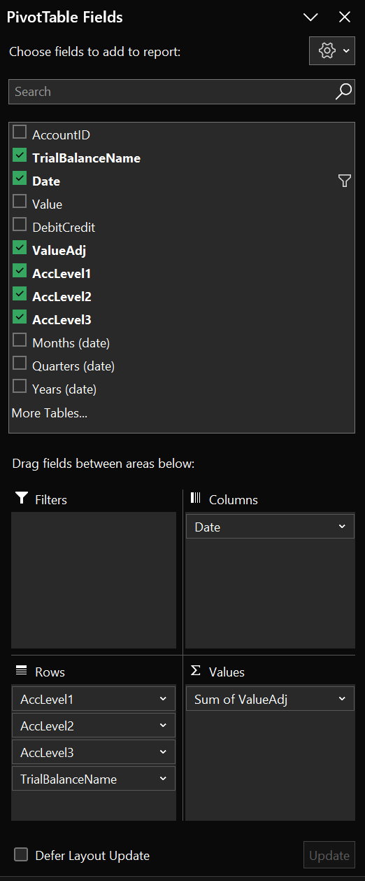
PivotTable field setup showing how to drag and drop account hierarchy fields to Rows and amounts to Values area
Refreshing Data
Remember that a PivotTable is connected to its source data snapshot (called the pivot cache). If the underlying data changes or new data is added, you need to Refresh the PivotTable (right-click the PivotTable and select Refresh, or use the Refresh All button on the Data tab) to update the calculations. If your source is an Excel Table, the PivotTable will automatically include new rows after refresh.
Best Practices and Helpful Tips & Tricks
Use Meaningful Field Names and Built-in Number Formatting
Use meaningful field names instead of default pivot field names. The default names like "Sum of Amount" can be renamed to something cleaner (e.g., just "Amount" or "Balance"). Simply click on the field header cell and type a new name.
Always use the Pivot's built-in number format functionality instead of formatting individual cells, as this preserves formatting through refreshes.
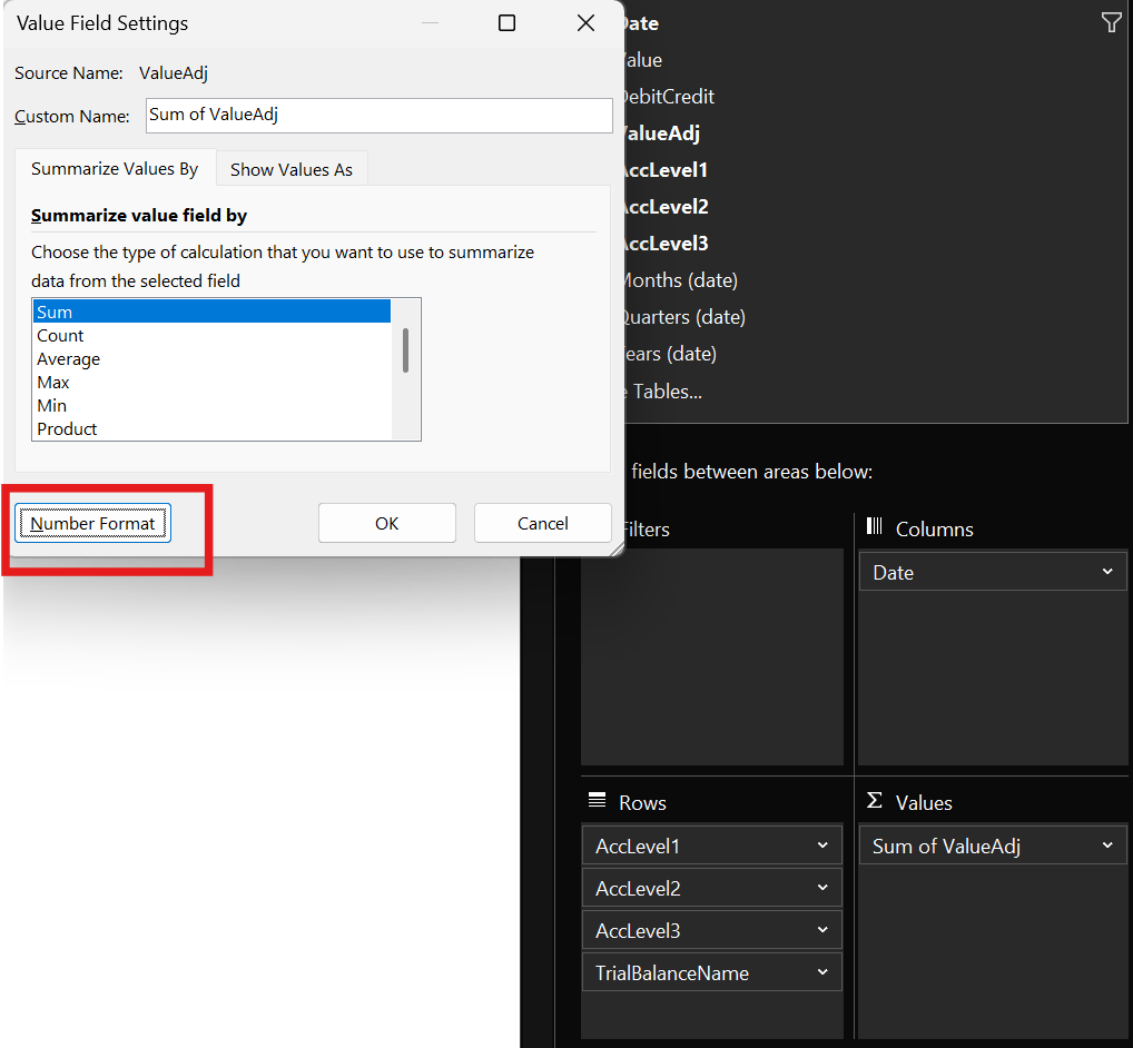
Value Field Settings dialog showing the Number Format button for applying custom formatting to PivotTable values
Expand/Collapse Multiple Hierarchies at Once
For account hierarchies in financial statements, you can quickly expand or collapse entire levels at once. This is particularly useful for financial statements where you want to show or hide account details across the entire report simultaneously.
Here's how: Right-click on an item of the hierarchy level you want to expand → Expand/Collapse → Expand Entire Field.
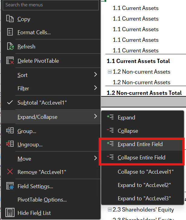
Expand or collapse multiple items on the same hierarchy level
Note: Lower-level hierarchies will remain expanded when you collapse higher-level ones. To ensure the best experience when expanding hierarchy levels, you should collapse each level individually.
Nested Sorts for Financial Statement Order
You can sort each category separately, which is particularly useful for financial statements where you want accounts in a specific order within each category (e.g., Assets in liquidity order, Expenses by importance).
Here's how: Right-click on any account within a category → Sort → choose your preferred sort option.
Note that unfortunately there is no absolute sort option available, so if you want to sort expenses (negative) by magnitude, your revenue accounts (positive) will be in the wrong order.
PivotTable Data Sources
The simplest and most common way to create a PivotTable is by choosing From Table/Range after selecting your data range. It can be either a simple data range, or even better, an Excel Table, which is better for maintenance as Excel tables automatically adjust if new rows are added.
However, you should know that there are also more advanced options:
From External Data Source: You can also create a PivotTable using data from external sources, such as SQL databases, PowerBI, online services, APIs, cloud storage, BI tools, and other files. The advantage of this method is that data is accessed via a connection, which keeps the file size relatively small. This approach is efficient for handling large datasets, as the data is not stored directly within the Excel file, allowing for quicker updates and better performance.
From Data Model: You can also use a Data Model as a source for your PivotTable. This approach is useful when working with multiple related tables or complex datasets. By leveraging the Data Model, you can create relationships between different tables and perform more advanced data analysis.
Using the data model also enables cube functions. These functions can be combined with slicers and PivotTable filters, and they access the same data as the PivotTable (but without needing to use a PivotTable). If you’re familiar with GETPIVOTDATA, think of cube functions as a more powerful alternative.
Choose the Right Layout: Compact vs Tabular
We used compact layout in the examples above as it is the closest to the standard SUMIFS P&L approach. However, you'll also often see and use tabular layout, which lays out the mapping information into additional columns and provides better structure for data export.
Here's how: Right-click the pivot → Design → Report Layout → choose Compact or Tabular Form.
Tabular Layout in Excel PivotTable
Enable Repeat Item Labels for Data Export
This fills in category labels on each row in Tabular form, which is essential if you plan to copy or export the pivot table data for use elsewhere.
Here's how: Right-click the pivot → Design → Report Layout → Repeat All Item Labels.
This ensures every row has complete context when you convert the PivotTable to static data.
Tabular Layout in Excel PivotTable with repeated item labels (here row labels are repeated)
Configure Subtotal Display
You can show subtotals at the top or bottom of groups (or no subtotals at all) to match your preferred financial statement format.
Here's how: Right-click the pivot → Design → Subtotals → choose your preferred placement.
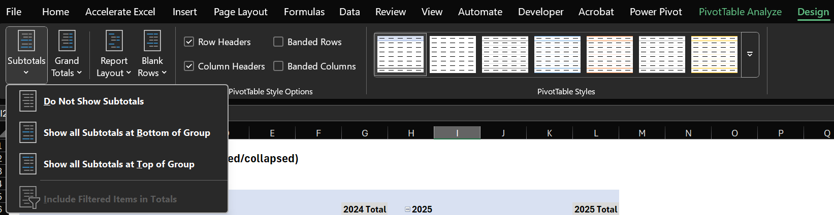
PivotTable Design menu showing subtotal options for better financial report formatting
Show Missing Values as Zero
Empty cells in financial reports look unprofessional, which is why you should configure the PivotTable to show 0 instead of blanks.
Here's how: Right-click the pivot → PivotTable Options → Layout & Format tab → check "For empty cells show: 0".
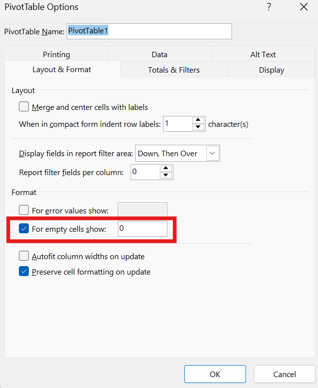
PivotTable Options dialog showing how to display empty cells as zeros for cleaner financial reports
Preserve Custom Formatting Through Refreshes
Prevent losing your custom formatting when data refreshes by adjusting these key settings.
Here's how: Right-click the pivot → PivotTable Options → Layout & Format tab:
Check "Preserve cell formatting on update" to maintain custom formats after refresh
Uncheck "Autofit column widths on update" if you've set column widths manually
This ensures your professionally formatted reports maintain their appearance as data updates.
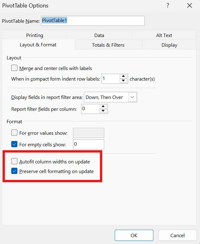
PivotTable Options showing formatting preservation settings for professional financial reports
Customize PivotTable Styles
You can adjust styles to customize the format of the Pivot Table, for example to add subtotal borders or modify colors to match your company branding.
Here's how: Select PivotTable → Design → PivotTable Styles → right-click any style → Modify.

PivotTable style customizations
This allows you to create professional, branded financial reports that maintain consistency across your organization.
Copying a Custom PivotTable Style to Another Workbook
If you created a custom PivotTable style (via the PivotTable Style Gallery), you need to transfer it manually because styles are saved at the workbook level.
Here’s how:
Open Both Workbooks: Open the source (with the custom style) and the target workbook.
Copy a PivotTable Using the Style:
In the source workbook, select a PivotTable that uses the custom style.
Copy it (
Ctrl+C) and paste it into the target workbook.
The Style Transfers: Excel will transfer the custom style with the PivotTable into the target workbook.
Now in the target workbook, you can find the style under PivotTable Tools → Design → PivotTable Styles.
Use Slicers for Client-Friendly Filtering
Instead of using traditional filters, consider adding slicers. Slicers function similarly to filters but provide a more intuitive, visual interface, making them easier to use and understand, especially for clients or team members who may not be Excel experts.
Here's how: Go to the PivotTable Fields panel, right-click on the element you want to use as a slicer and select "Add as Slicer".
Slicer interface showing month filters for financial PivotTable
Format Slicers
You can customize the appearance of slicers. Particularly useful is showing multiple columns.
Here's how: Select Slicer → Slicer→ Buttons → Columns.
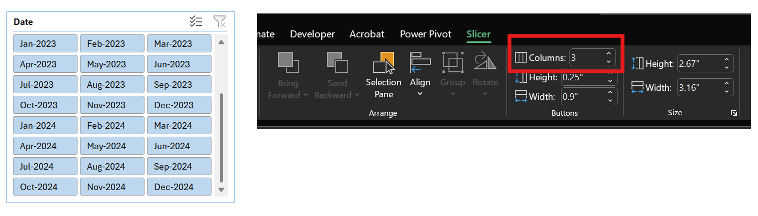
Multi-column slicer layout for month selection - more compact and user-friendly than single-column display
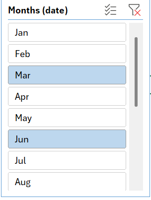
Insert Timeline for Period Analysis
For data containing date fields, you can use a Timeline to filter your PivotTable by specific periods. This interactive visual tool makes it easier to analyze trends over time.
Here's how: Go to the Insert tab, click on Timeline, and select the date field.
Link Slicers Across Multiple PivotTables
You can connect a slicer to multiple PivotTables—as long as they all use the same data source. Once linked, clicking the slicer updates every connected PivotTable at once, helping you quickly explore different views of your data.
Here's how to link a slicer to multiple PivotTables:
Use the same data source - Make sure all PivotTables are built from the same range, table, or data model
Add a slicer - Select one PivotTable, go to Insert ▶ Slicer, and choose the field you want to filter by
Link the slicer - Click the slicer, then go to the Slicer tab and choose Report Connections. Check the boxes for the PivotTables you want to connect
Add more slicers if needed - For different fields, insert new slicers and repeat Step 3
Now your slicers control all linked PivotTables at once—making it easy to compare and explore your data across multiple reports simultaneously.
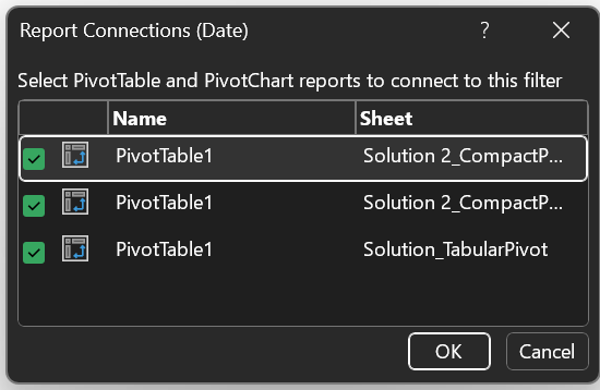
Multiple PivotTables connected to the same slicer showing coordinated filtering
Customize the PivotTable’s Value Field Calculation
The PivotTable value field summarizes values. For numeric data, the default aggregation is SUM. You can adjust the value field calculation (and reference the same value field multiple times) to:
Show a SUM of values
Display absolute variances between columns (here half-years)
Display relative variances between columns

Balance Sheet Pivot Table with end of period balances as well as absolute and relative period-over-period variances calculated automatically
Here’s how: Drag and drop the value field a second time into the value area → Value Field Settings → Show Value As → Difference From → Base Field → Date → Base item → Previous.
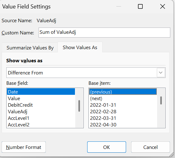
Using "Difference From" in Value Field Settings to calculate period-over-period variances automatically
Calculated Fields and Items
PivotTables support calculated fields (new columns based on existing data) and calculated items (new rows within existing categories). I generally don’t recommend using them. I can count on one hand the number of times I’ve found them useful in practice. The functionality is limited, and the experience can be clunky. For most use cases, well-structured source data combined with the built-in value field settings (like sum, average, % of total, etc.) provides a solid basis for powerful analysis.
If you require more complex calculations, it’s usually better to perform them outside the PivotTable. For fully dynamic and advanced PivotTable calculations, consider using Power Pivot with DAX, which offers far greater control and capability.
Grouping Dates and Numbers
Finance professionals often need to group data by fiscal periods, quarters, or custom date ranges. PivotTables make this easy:
Right-click on date fields to group by months, quarters, or years
Group numerical data into ranges (useful for aging reports or performance bands)
Clone PivotTable for Multiple Entity Reports
To create multiple PivotTable reports from one base PivotTable, you can utilize the "Show Report Filter Pages" feature. This allows you to generate individual reports for each unique value within a filter field (perfect for creating separate reports by subsidiary, department, or business unit).
Here's how:
Set up your base PivotTable - Create your PivotTable with the desired data and field layout
Add a filter field - Drag the field you want to use for creating separate reports into the "Filter" area (e.g., "Business Unit" field)
Access "Show Report Filter Pages" - Navigate to the PivotTable Analyze tab → Options button dropdown
Generate the reports - Select "Show Report Filter Pages", choose your filter field, and click OK
Review the results - Excel automatically creates a new worksheet for each unique value in the chosen filter field
Data Model Integration
For complex financial reporting involving multiple data sources (GL data, budgets, actuals, exchange rates), leverage Excel's Data Model capabilities to create relationships between tables and build comprehensive financial reports.
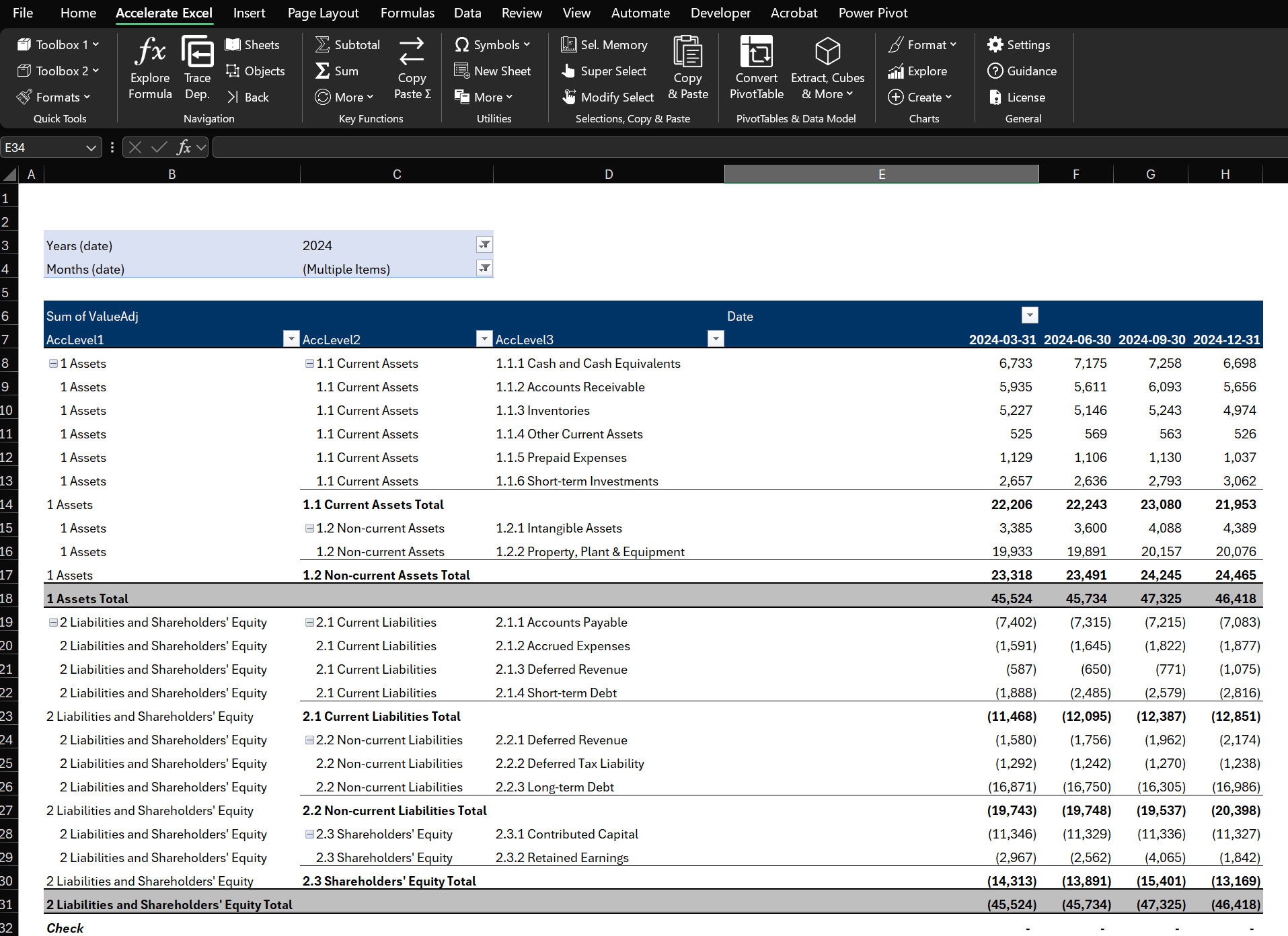
Accelerate Excel & PivotTables
For professionals who build or audit complex Excel workbooks using keyboard shortcuts and other time-saving utilities is a competitive advantage. Accelerate Excel, our specialized Excel add-in, has been made to streamline your Excel workflow. Below you’ll find the PivotTable-focused capabilities.
Automatically Convert PivotTables to Regular Cells
While PivotTables are fantastic for analysis, there are times you might want to convert a PivotTable into a more static, regular worksheet format. Common reasons include:
Sharing Reports: You might need to send a report to someone who is not comfortable with PivotTables, or to paste a summary into Word or PowerPoint. Converting the PivotTable to a normal range (values) ensures the layout and numbers stay fixed, no matter how the data changes.
Custom Formatting or Editing: Some final reports require formatting or annotations that PivotTables do not easily allow (for example, inserting rows of commentary, custom subtotal lines, or different font styles for specific rows). By converting to a normal range, you gain full freedom to tweak the report.
Preventing Accidental Changes: A PivotTable is interactive by nature. If someone clicks a slicer or rearranges fields, they could inadvertently change the view. A static table is "locked in" and not subject to pivot operations, which can be safer for certain use cases.
Complex Calculations: If you need calculations that are too complex for PivotTable formulas or you want to use standard Excel formulas referencing the summarized data, having the pivot results in normal cells can be easier to work with.
Traditionally, the way to do this is manual: you would copy the PivotTable and use Paste Values to get just the numbers, then reapply some formats and formulas. Our add-in offers multiple automatic conversion methods:
Hard-coded values for snapshots
SUMIFS formulas to link to the underlying source data
GETPIVOTDATA references to link to the initial PivotTable
Advanced cube formulas for more complex scenarios
Format PivotTable
Simultaneously apply standard PivotTable design properties. Ideal to apply the same settings quickly on multiple PivotTables.
Next Steps
Ready to apply these techniques? Download our practice templates and follow our step-by-step tutorials:
More Excel tips and shortcuts:
FAQ
Why is my PivotTable showing counts instead of sums?
Excel automatically decides whether to sum or count based on the source data. If a value field contains blanks or text in any cells, the PivotTable will default to Count (because it cannot sum text). To fix this, ensure the source column has only numeric fields. You can also manually set the value field to sum: click on the field in the Values area, choose Value Field Settings, and set it to Sum.
How do I update my PivotTable when new data is added?
After adding new rows to your source data, you should refresh the PivotTable (right-click the PivotTable > Refresh). If your PivotTable source is a dynamic range or an Excel Table, it will automatically include the new data upon refresh. If it's a fixed range that does not cover the new rows, you may need to update the PivotTable's data source range (via PivotTable Analyze > Change Data Source) to cover the expanded dataset.
Can I create a PivotTable from multiple tables or data sources?
Yes. In modern Excel, you can use the Data Model (Power Pivot) to build PivotTables from multiple related tables. When you insert a PivotTable, check the option "Add this data to the Data Model". You can then add fields from different tables (after defining relationships between those tables, similar to a relational database). This allows analysis across multiple tables (for example, sales data and quota data in one pivot). Alternatively, you could use tools like Power Query to combine data into a single table before pivoting, or the legacy "Multiple Consolidation Ranges" feature (though that is less flexible).
What is GETPIVOTDATA and how can I use it (or turn it off)?
GETPIVOTDATA is an Excel function that automatically generates when you try to reference a cell inside a PivotTable from outside. It returns the value from the pivot based on the field names. This can be useful to always fetch the correct value even if the pivot layout changes. However, some users find it annoying when they just want a simple cell reference. You can disable automatic GETPIVOTDATA by clicking the small arrow under the PivotTable Analyze menu's Options and toggling off Generate GetPivotData. If you do use GETPIVOTDATA, be aware that it will lock onto specific field names and pivot configurations; if those change, the function may need to be updated.
When should I use a PivotTable versus formulas or other tools like Power BI?
Use PivotTables for quick, flexible analysis on data that fits in Excel and is arranged in a table format. PivotTables are often faster and more reliable than creating equivalent summaries with manual formulas (like multiple SUMIFS). If you require highly customized calculations or presentation that PivotTables cannot accommodate, you might use regular formulas or functions after getting a pivot summary (or convert the pivot to formulas as described earlier). For extremely large datasets or more complex analytical needs (like combining many data sources or creating interactive dashboards), dedicated tools like Power BI or database pivoting (via Power Pivot in Excel) may be more appropriate. In many cases, though, PivotTables hit the sweet spot for ease-of-use and power in everyday Excel analysis.